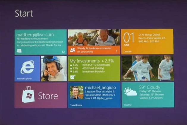
Microsoft will stick with the Windows Phone 7 inspired tile interface for Windows 8, but users will get a heavier option they can switch to on demand.

Interface switching was Microsoft Windows 8 team's response to the battle of tastes between tablet and PC users.
Microsoft unveiled its lightweight “app centric” Windows Phone 7 tile-style interface, dubbed Metro, in June this year.
Windows 8 users could think of the old desktop UI as “just another app”, Windows boss Steven Sinofsky explained on a blog.
“If you want to stay permanently immersed in that Metro world, you will never see the desktop—we won’t even load it (literally the code will not be loaded) unless you explicitly choose to go there!”
Microsoft recently revealed it would also be including an Office-inspired "ribbon" display system for the Windows 8 Explorer.
Windows 7 desktop users who are familiar with icons and its Aero interface shouldn’t think that the touch-friendly interface meant the old way of getting things done was bad.
“The mechanisms that people rely on today (mice, physical keyboards, trackpads) don’t suddenly become less useful or “bad” just because touch is also provided as a first-class option,” said Sinofsky.
While many of the 200-odd comments to the blog post were positive, some were not pleased with the split interface.
"[T]reating the traditional UI as a second-class citizen is a serious mistake. If Windows 8 goes this way, I predict it will have the same fate as Vista: it will be ignored until something better comes around," said one commenter.
The two options would allow the same operating system to move between tablets, flexible laptops and devices that dock into large systems.
Sinofsky said that despite its belief that the Metro interface would serve most needs, Microsoft would still improve the desktop interface, however he offered no details on what these improvements would look like.
Developers could “target the APIs that make sense for the software they wish to deliver”, he pointed out.


